Identity
On Design of Union of Actors' Corporate Identity
Stage, theater, screen and microphone actors have started an initiative to establish the Union of Actors. The main objective of the initiative that has aroused emotions of unionism and solidarity among the artists was to force the establishment of necessary regulations about the profession of acting, through unionist struggle.
One point specifically attracted our attention while making preliminary
investigations about the corporate identity of the Union of Actors. Most of the
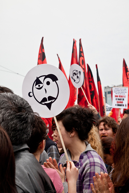
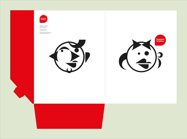
corporate identities/logos that have been created about acting consisted of
either crying or laughing faces. Acting was reduced to visual designs similar
to these. Nevertheless, throughout the history, actors have interpreted an infinite
number of different characters in infinitely various stories. Here, we
have tried to do two impossible things: Both reflecting the variety whose one
side goes as far as improvisation and reflecting the future without
being contented with symbolizing acting with just the past.
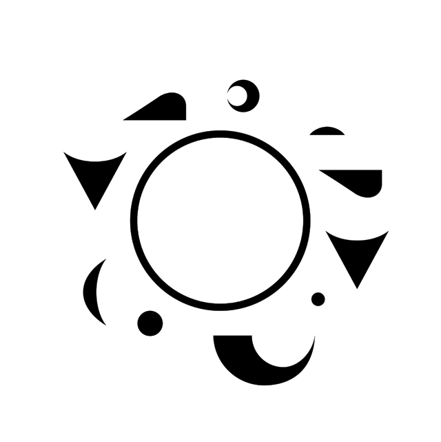
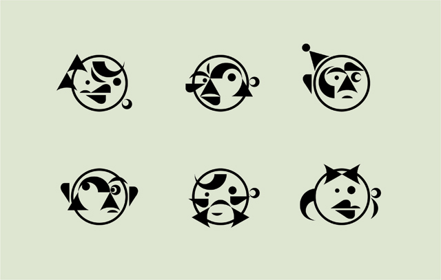
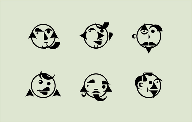
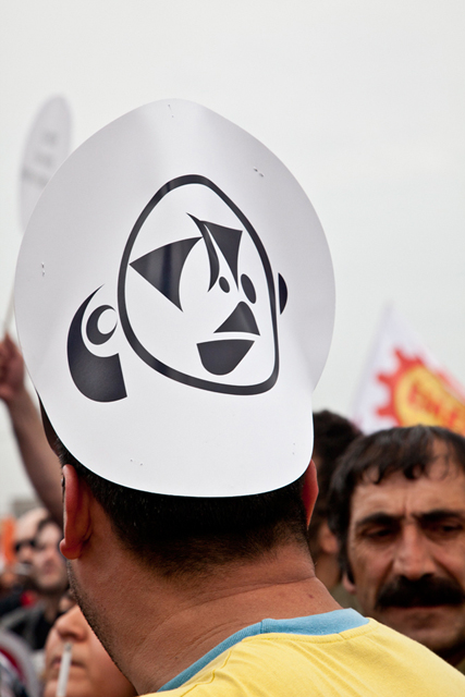
11 geometric elements are given below. We can obtain an infinite number of characters when these 11 elements come together in different combinations. Woman, man, gay, child, juvenile, elder, innocent, killer, servant, aristocrat, terrible, funny, stupid, intelligent, calm, surprised, anxious, star, extra etc. We had only one criterion within this variety of characters. And it was that all of the characters would be as dramatic as they were in films or on stage. It was important that faces would reflect a situation or an emotion with their mimics.
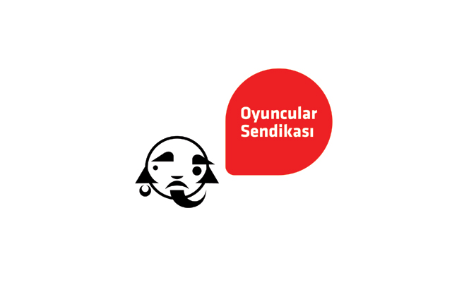
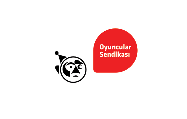
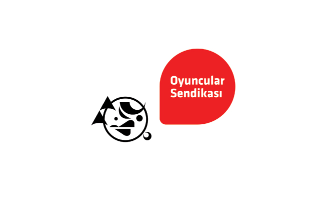
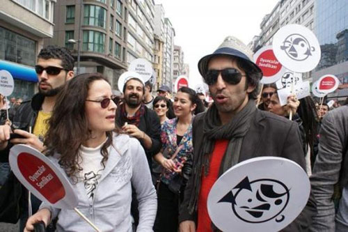
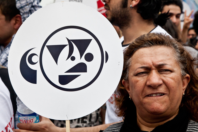
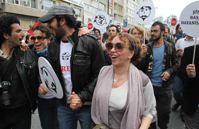
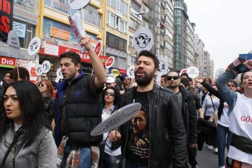
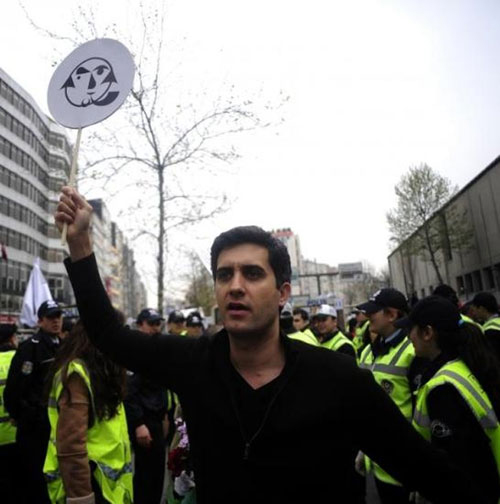
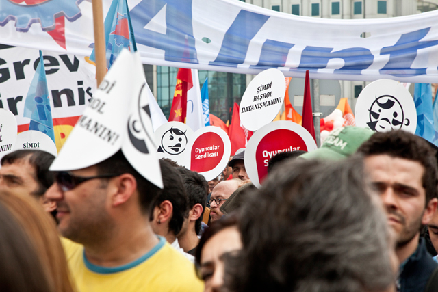
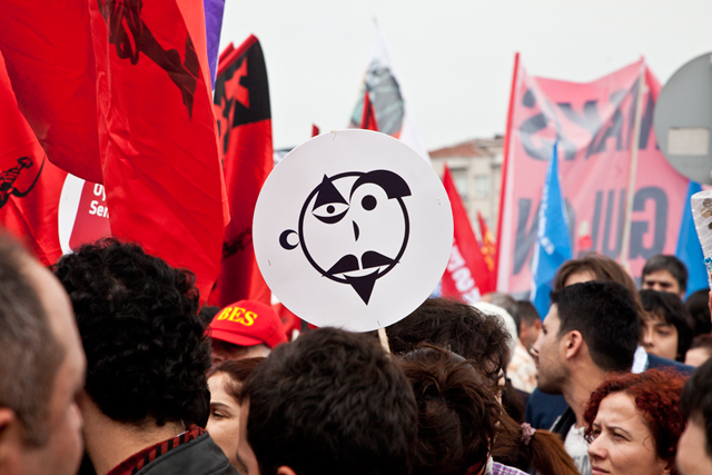
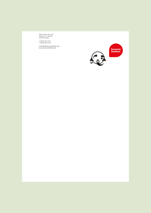
Different in letterheads, different in business card of each person, different in signboards, different in Mayday banners etc. In short, a different representation in each different situation where the logo is used. We wanted the sum of these differences to imply pluralism and the strength of the union.
In our first presentation, along with the characters we have designed, we presented the 11 elements that compose the logos as shorn magnet pieces on a white tinplate in order to help the executives of the union to create their own characters. In a sudden, the presentation turned into an amusing game.
- Oksipan
- Oyuncular Sendikası
- Atea
- Ersoy Hospital
- Kale Altınay
- Ulusoy Holding
- 2011 - 2012
- 2005 - 2010
- 2000 - 2005
- 1991 - 2000
CORPORATE IDENTITY
LOGOS
Copyright © 2010 - Deney - All rights reserved.